Let’s Create a Landing Page
There is simply nothing more motivating that getting something out, published and viewable to get us moving. So let’s create a landing page with the assumption that we are starting a business. We know enough about Hugo that we should be able to reasonably create as many landing pages as we might ever need with just the information in these four blog posts. To help us along the way, I’ve compiled a list helpful articles that I’ve curated over time on the ins and outs of building landing pages.
[TODO create a page of curated links for landing pages]
Where To Start?
Start with the layout and we’ll add content as we go. Our baseof.html layout should work fine for our purposes. But let’s create another, new layout, this one will be in the _default directory and will be named index.html. This is a kinda special layout in that it is only ever rendered by Hugo when someone goes to the home page of your site. It’s a technical note, but worth describing here, when someone goes to your home page, most webservers treat that as a request for the root resource or “/” with nothing following it. Most webservers see that request and automatically append a index.html behind the scenes and then return that file to your web browser. <- This should be a side note and could link to a series of articles on web requests.
Break a Landing Page Down
A landing page will typically have three main components: a header that includes a list of links either to other pages or to content further down on the page, a main content area usually containing a product headline, one line description of what the product does, some graphic elements and some type of call to action, e.g. enter your email.
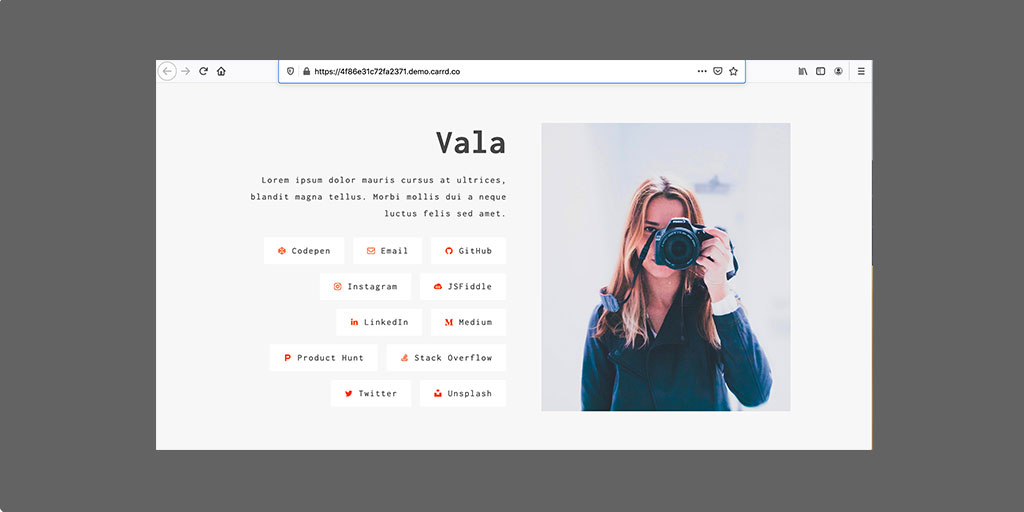
Here is an example landing page off of the site carrd.co.
Example Landing Page
That looks really decent, yeah? Whenever I see something like that, I think to myself “wow, how cool would it really be if I were able to make something that looked even half as good?” Well, here’s the truth: there is, no doubt, a lot of polish that goes in to making something like that look so nice. However, you can get 80, maybe even 90% of the way there with some very simple, anyone-can-learn techniques.
Let’s Start!!!
Here is my drawing on that example landing page to show the three main content pieces. By breaking this design down into three parts we make this easier to build.

Example Landing Page Annotated
Simply stated, we’ll create three boxes. One large box which will serve as a container of sorts for the two other boxes we’ve created. Our approach here will be kinda like do-re-mi in the Sound of Music, we’ll take each one separately and then we can combine them in a million different ways to make some interesting combinations.
Creating the Header
Before we get too far ahead of ourselves, let’s create a very simple header navigation menu. We can always make this nice later, so let’s just stub something out for now.
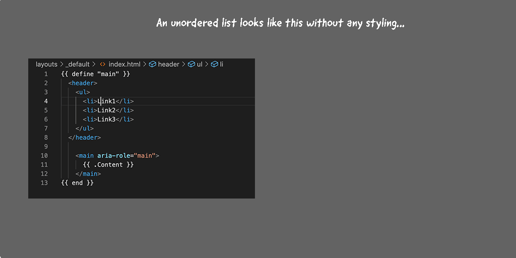
One of the simplest and most basic headers is comprised of just a list. We’ll use an unordered list element that we will arrange horizontally across the top of the page. We’ll also make this super, super simple by not even using CSS classes, we’ll just put the style directly in-line.
<ul>
  <li>Link1</li>
  <li>Link2</li>
  <li>Link3</li>
</ul>
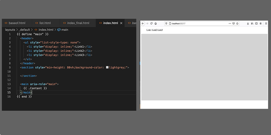
is the most basic list html element out there. Let’s convert this list into an top header / navigation bar with the following css styles:
<ul style="list-style-type: none;">
  <li style="display: inline;">Link1</li>
  <li style="display: inline;">Link2</li>
  <li style="display: inline;">Link3</li>
</ul>
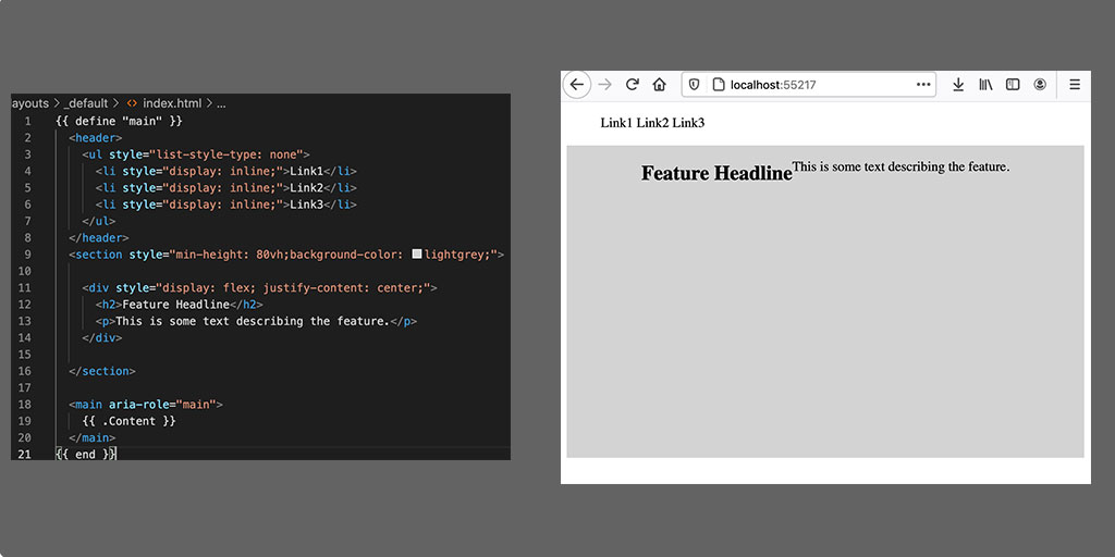
Crazy easy right? If we put that html element within our _index.html layout, we’ll have the easiest, fastest header nav bar. Here is what our _index.html should look like now:
Code View of Header List
We can certainly improve that header nav bar in the future, but for now, it will serve our purpose pretty well. Now we can do all sorts of things from here - we could center, left align, right align the navigation on the page, we could increase the spacing .. etc. For our purposes here, we have the foundation built, so let’s move on to creating the body content.
Creating the Body Content
Creating something that resembles a hero content page can be just as straightforward as the above header and navigation links. It just requires a tiny bit more work. Let’s start off by simply creating a <section> html element with:
<section>
</section>
The job of the section element is to create the space within which our content will be seen, so, let’s give our section some height and, to make it a little bit more visible we’ll give it a background color with:
<section style="min-height: 80vh; background-color: lightgrey;">
</section>
and it should now look like this:
Hero Section With Background Color
And, just like that, we have created the first, outer-container box from our diagram above. Pretty cool, yeah?
Breaking The Hero Content Out Into Containers
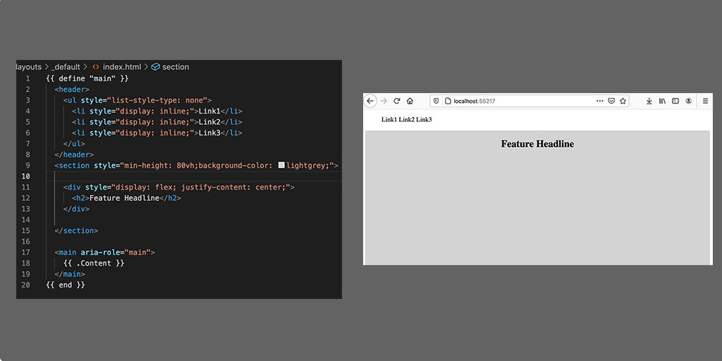
Step 1. Create the Feature Headline
Honestly, there is really no right or wrong way to go about these next steps, this is just the order that I picked and that makes the most sense to me. So, we know that we want something that I’ll just call a feature headline - something that grabs the attention of the reader with some descriptive text underneath it. Lets use an h2 for the feature headline. This pretty straightforward, here is what it looks like:

Feature Headline
hmmmm…
Now there are literally THOUSANDS of discussions surrounding how to center things on the Internet. We’re not gonna get into that here. Let’s use a solution that is easy to implement. We’ll add another <div> element around our content and we’ll use the display: flex; style to center it. The code for that looks like:
<div style="display: flex; justify-content: center;">
  <h2>Feature Headline</h2>
</div>
And here’s what that looks like:
Feature Headline Centered
mmm that’s better!!! Now lets add the feature description:
<div style="display: flex; justify-content: center;">
  <h2>Feature Headline</h2>
  <p>This is some text describing the feature</p>
</div>
Feature Headline with Text
… eeesh that looks horrible!!! What the heck??
Yeah, that’s flexbox! Honestly, seeing what flexbox does visually, I’ve found, is the best to understand it. Believe it or not, what we are seeing here is a HUGE improvement over how design in CSS used to work. We’re not even going to go into it - I won’t bore you with the details! But, just getting the above used to be a really difficult thing - even though it looks crazy off.
Fixing that gaffe is actually very easy, albeit crazy unintuitive … we need to add yet another <div> element.
<div style="display: flex; justify-content: center;">
  <div>
    <h2>Feature Headline</h2>
    <p>This is some text describing the feature</p>
  </div>
</div>
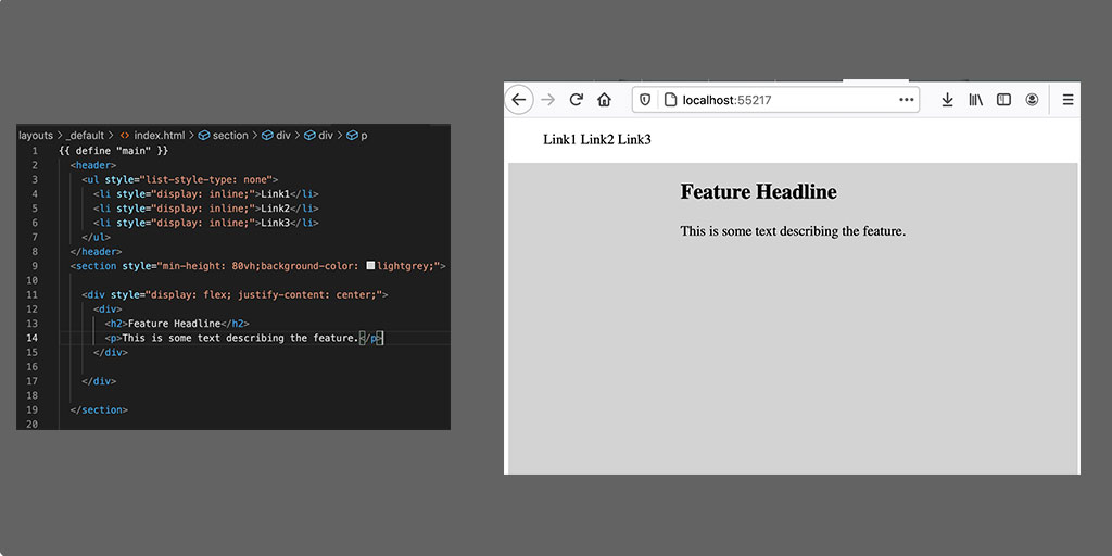
Feature Headline with Text Centered
Now we are getting somewhere, our headline shows up above our descriptive text, which is definitely what we want. Remember, we wanted to include an image here in our hero content, so let’s include that as well.
First, we need an image … I’m not all too partial to whatever image we want to use so let’s just head over to Unsplash and use something from there. I chose the image show below with full credit to the owner in the footnotes below.
We needed to drop the image into the static folder and then reference it from within our template:
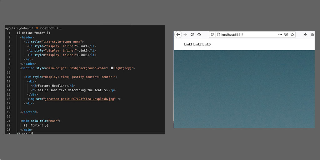
Feature Headline with Graphic
Whoa nelly!!! That image is HUGE!!! So much so that we can’t see anything else. Let’s change that by adding a width to the image.
Feature Headline with Graphic
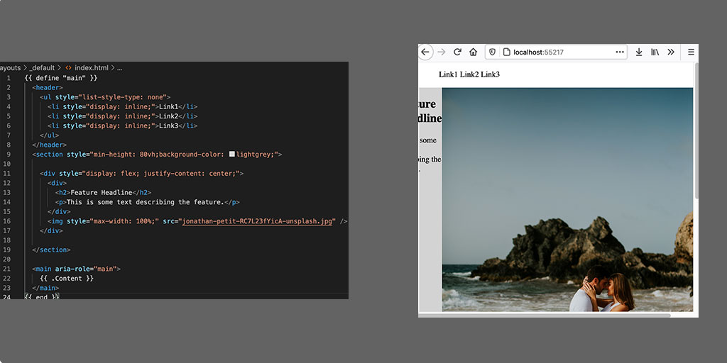
That helped … but it probably isn’t the best way to complete this. Let’s adjust the size by using yet another containing <div> element.
<div style="display: flex; justify-content: center;">
  <div>
    <h2>Feature Headline</h2>
    <p>This is some text describing the feature</p>
  </div>
  <div style="width: 275px;">
    <img style="max-width: 100%;" src="jonathan-petit-RC7L23fYicA-unsplash.jpg" />
  </div>
</div>
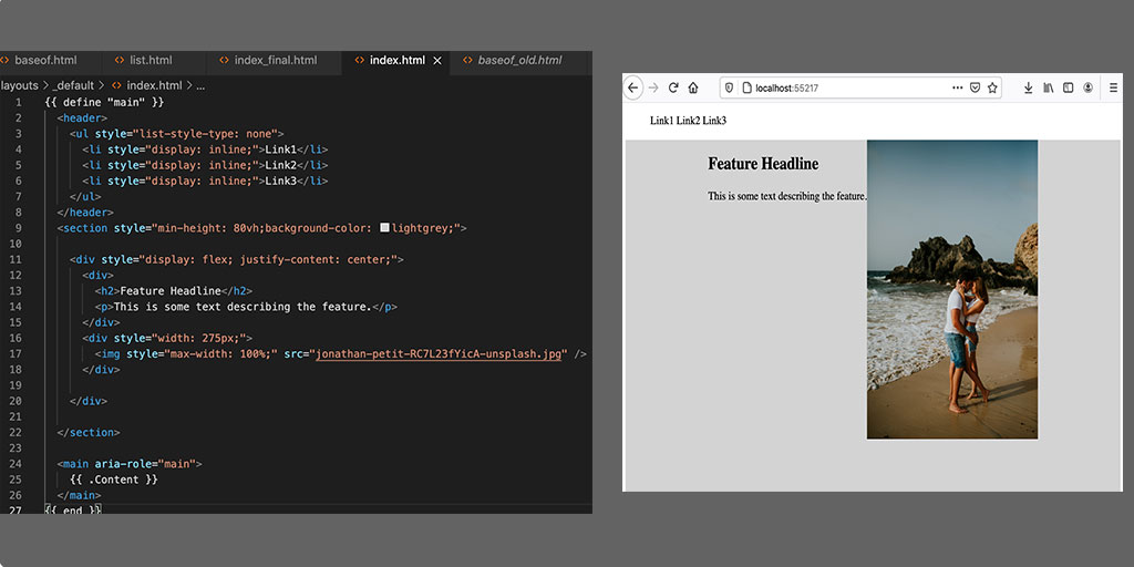
Feature Headline and Graphic Centered
Which is just about as close as we’re going to get here in this article!!!
You can really go down the rabbit hole in terms of trying to figure out the one ‘right’ way to do this and to make it look; you can add padding above, around. Options abound and you can have as much fun as you want.
Some will say you could make this a background-image, and there are myriad ways to scale this image. Again, this is one reason why I feel that CSS is believed to be so difficult: things behave a little bit unexpectedly at first, then when correcting for that unexpectedness, there are many different suggestions out there.
For now we have something that is pretty much what we want: a feature headline with some text beneath it and and image to the right side.
Now there are a ton of ways to take this to the next level and really add some polish. We’ll cover those ways in a future article, but for now, if you were just looking to scaffold out a landing page, you could get that done in about 10 minutes using Hugo and the base level of HTML & CSS described here. Good Luck!!!
Summary
Why learn this? There are plenty of sites out there that will create these types of landing pages for you, we’ve even linked to one of the most popular above, why not just use of them? Why go through the trouble here to learn how to do it yourself?
The answer is deceptive and it goes back to my hypothesis about why learning Hugo and static sites is a great way to get started.
The answer revolves around two things.
First, the longer you work the more you will want to do something that is unique and not yet offered by services like cardd. It’ll start by wanting to change one small thing and you’ll google how to do that and the service will likely have a way that allows you to customize what they offer. The way to customize will be different on any platform you choose to use. You have now invested time in learning how to customize something on another vendor’s platform. So your investment in that platform is not just what you paid to use it, which may actually be zero, but it is also in the time you took to learn about the customization and the tradeoff you made in accepting whatever that customization was.
Second, my argument is that time investment could be better spent with a minimal investment in learning how to build it yourself, keeping what will amount to nearly being no-charge service, not accepting any added constraints from a vendor and allowing you the ability to customize & tweak what you have done, over and over again with minimal cost.
Of course, we’re not yet done, we still need to create the footer, so let’s do that in a separate blog post because this one is already getting quite lengthy!!! Let’s verify this still get’s over to the published site.
Photo by Jonathan Petit on Unsplash